Wortecs
Worten's journey to Enterprise efficiency
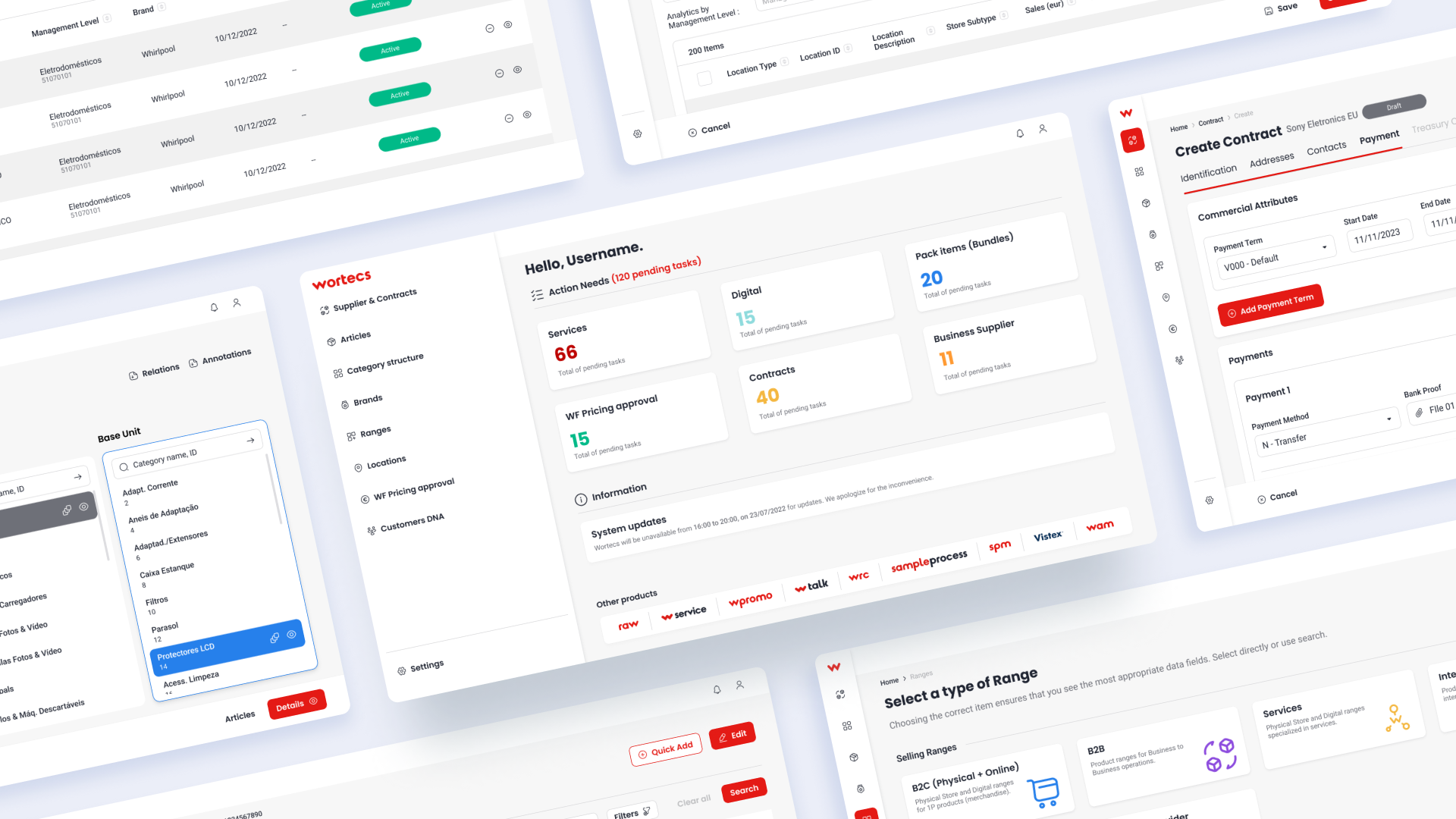
Wortecs is Worten’s internal ERP web-based app aimed to streamline business operations like inventory, logistics, and pricing. I led the UX for multiple features of this project, a process I will share in this case study.
A centralized management platform
Worten is the largest electronics retailer in Portugal, with over 240 physical stores across Iberia and the largest Portuguese e-commerce website. Wortecs aimed to merge legacy tools and introduce new services, with backend updates that would also sync data with SAP. Designed for wide adoption across departments, the main users of this product encompass the commercial, services, and after-sales teams.
The project, involving over 50 people, was segmented into modules to ensure focused development. Each team tackled specific modules independently, treating them as separate branches to enhance efficiency and accountability. The project was documented and managed using Confluence and Jira.
Four product designers collaborated on Wortecs’ overarching features, each assigned to specific modules. Initially focused on Product Categories, I later oversaw Business Partners and Product Range modules. I will be highlighting challenges, solutions, and learnings from these components.
Goals
- Seamlessly transition from existing tools to a single intuitive platform for complex workflows.
- Unify roles and departments by standardizing flows, terminology, and architecture.
- Enhance process efficiency through redesigned user journeys, prioritizing usability and business value.
Finding the right questions
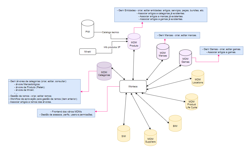
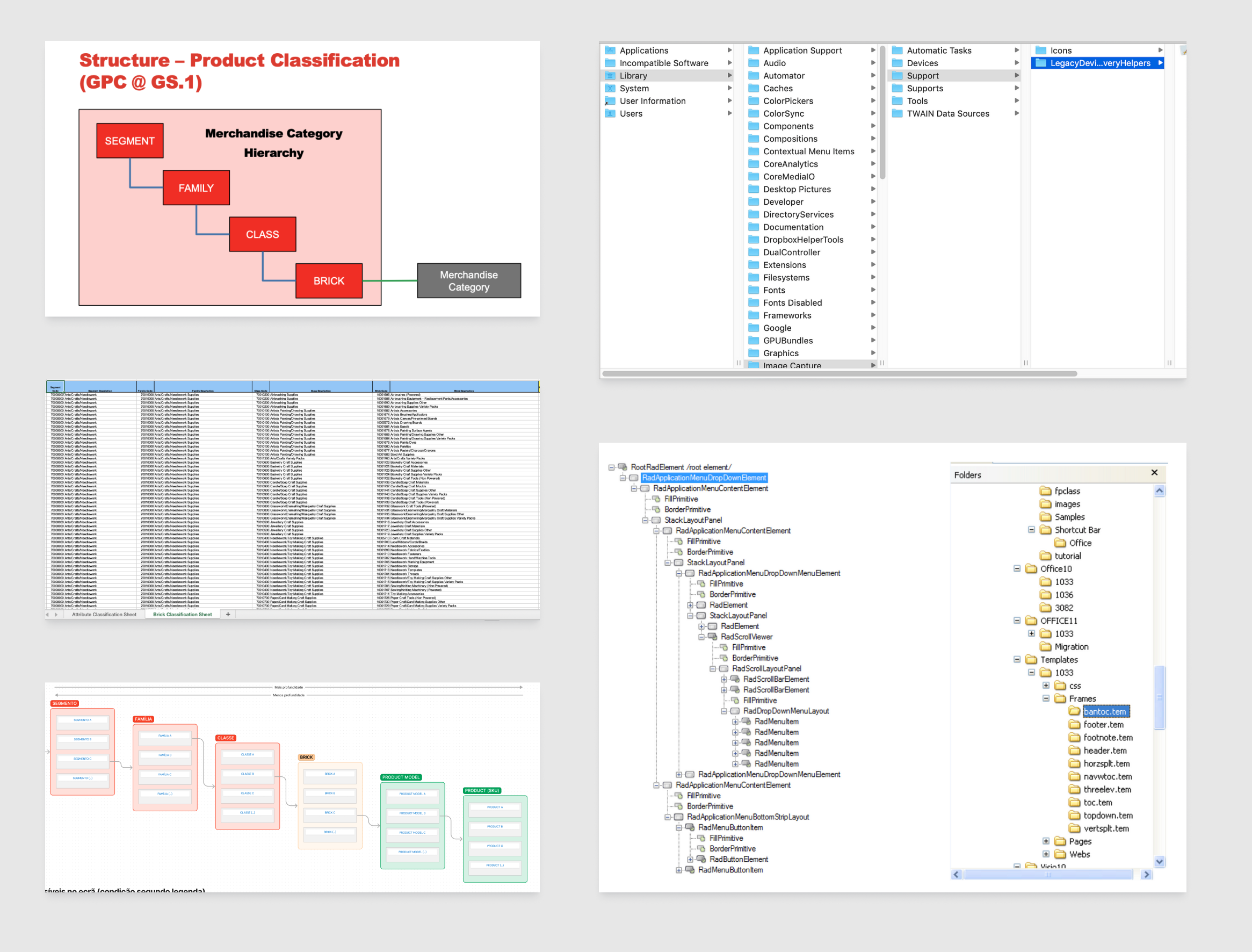
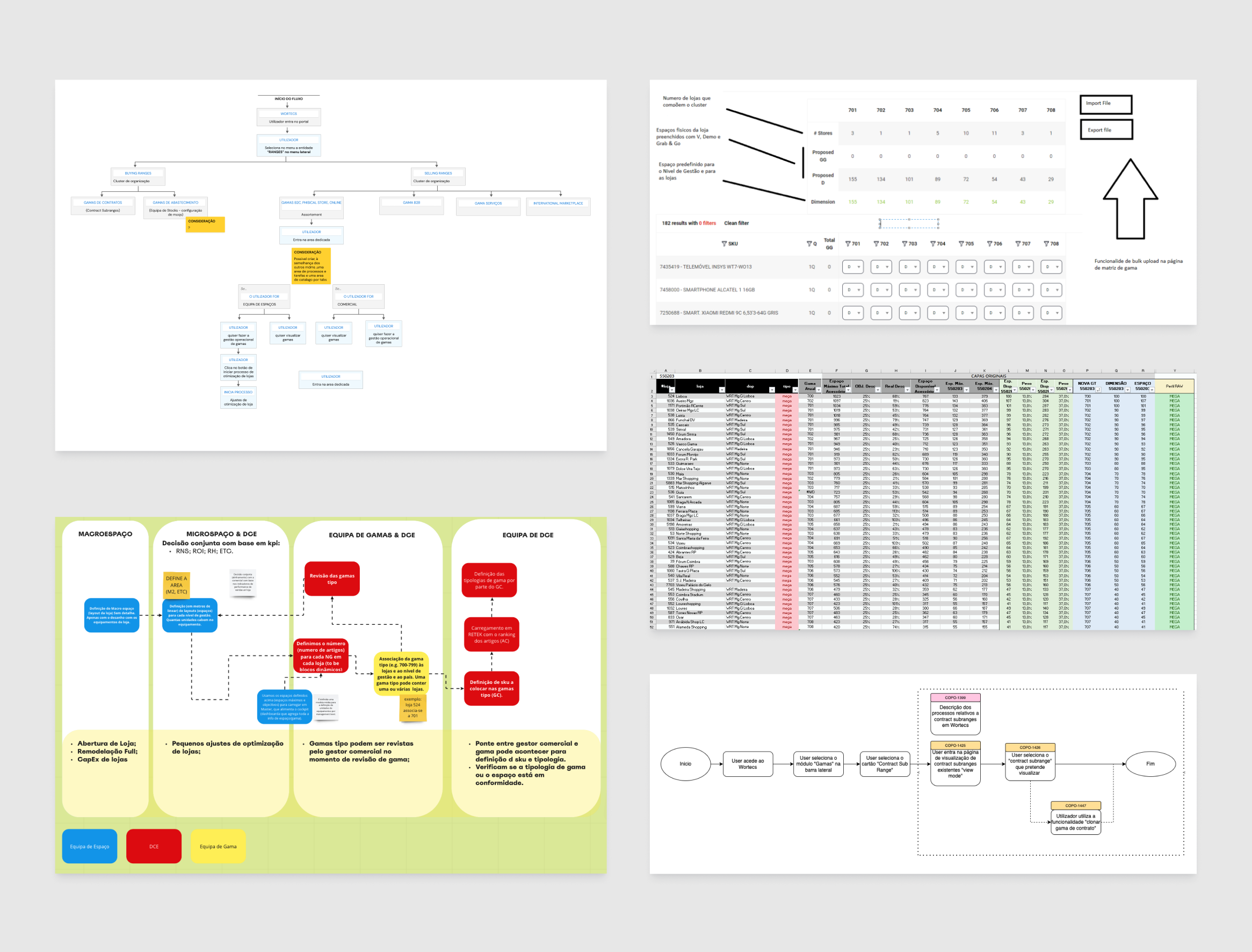
Due to the nature of the product, I dedicated a lot of time to exploring each module’s specifications, objectives, and processes. A lot of the mechanisms that would manage Wortecs are based on systems and architecture that are the backbone for most of Worten’s operations across all its products.
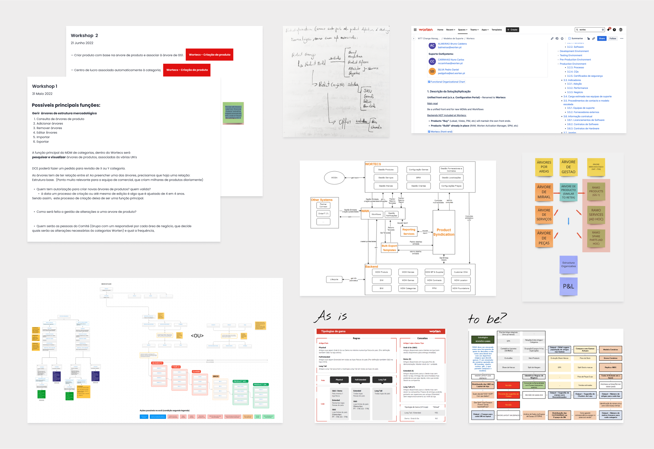
Extensive research was done through documentation, workshops, and interviews with product owners, business managers, and operational assistants, among others. The design team was focused on fully understanding the needs of the business, as well as the shortcomings of the current solutions.
One of the difficulties I found early on was how rigid some of the concepts, methods, and practices were across different departments. We often had to delve deeper into business intricacies, deciphering and mapping complex workflows and nomenclature along the way. During this phase, curiosity proved to be essential, as the ‘why’ became our most used tool and allowed us to connect the dots gradually.
As we kept mapping all of the product’s operations, we began to draw a big picture of how all the modules would interact with each other. Here we saw an opportunity to close the gap between different roles and departments, by uniforming language and methods.
Laying the groundwork for UX
Throughout this process, each product designer was focused on several modules, and the team would gather frequently to share the findings and discuss ideas about the product’s overall structure and logic. These sessions were vital to keeping the same UI/UX patterns throughout the product, speeding up the entire project, and providing consistent results.
After becoming comfortable with the overarching concepts and defining a broad strategy for the product, we refocused on each module. Here is a short description of what each of the modules I was assigned to aims to do:

Product Categories
This tool organizes Worten’s products based on their properties in a hierarchical structure.

Product Range
This module handles how Worten’s products are distributed across various channels.

Business Partners
Management of legal, financial, and logistical details of Worten’s suppliers and contracts..
Design
Taming the titan

Displaying hierarchy on Product Categories
Beginning with the Product Categories module, collaboration with the Product Owner, Tech Lead, and business agents facilitated goal-setting. While Worten’s product organization structure was familiar, SAP requirements required accommodating additional structures in the interface.
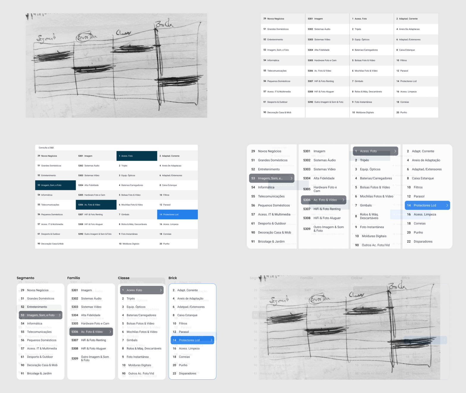
Given the visual nature of product structures, early ideation focused on various methods to illustrate hierarchy and determine the appropriate level of detail. Different visual interactions were tested to navigate the content’s structural complexity.
Initially, the product owner proposed a multi-level data tree resembling file browsers. However, since the module’s primary purpose was exploration rather than node manipulation, I suggested a concept focusing on displaying structure levels for quicker navigation.
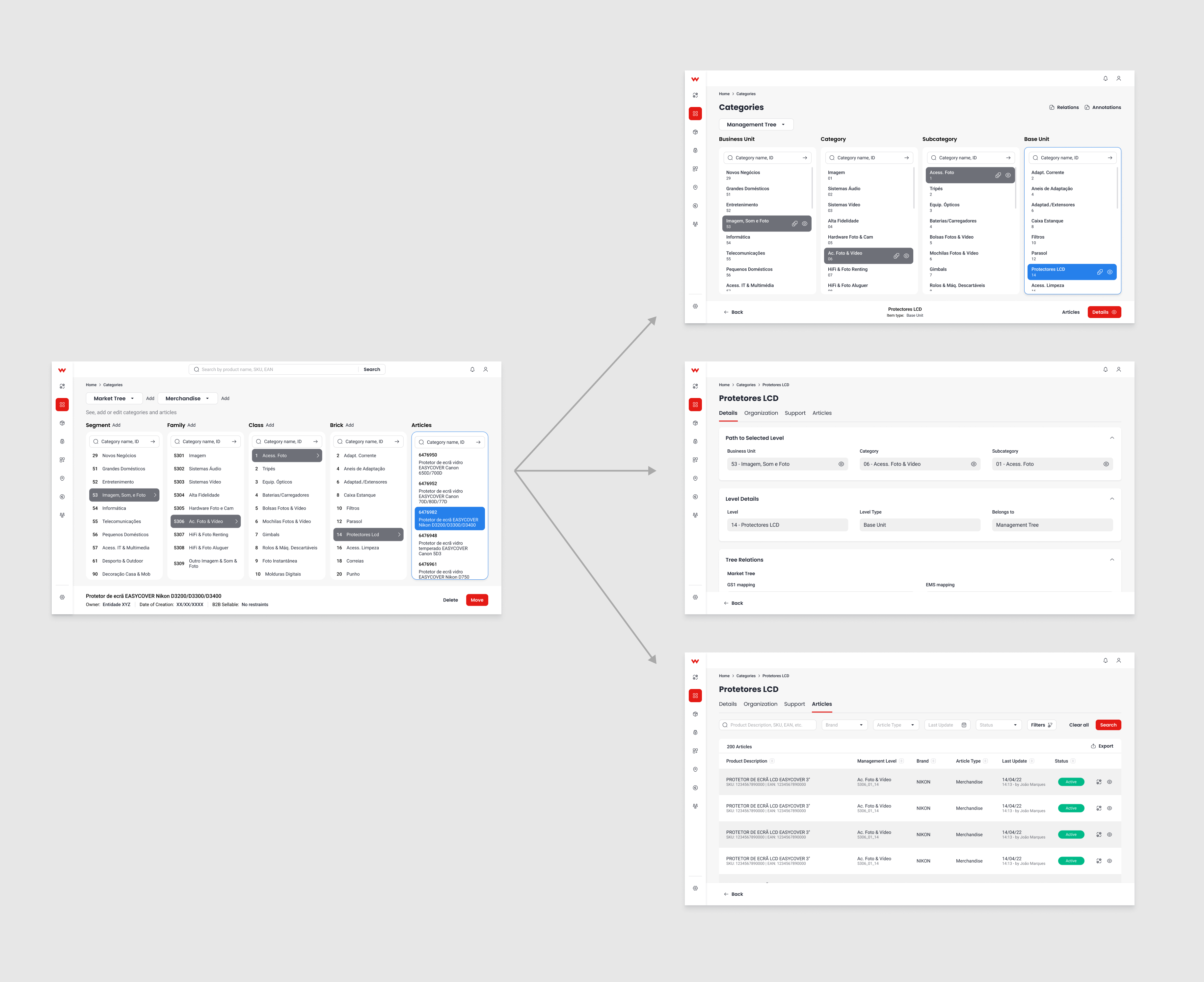
After several iterations, a forum comprising business managers, assistants, developers, and other relevant roles gathered to evaluate both options. Ultimately, the multi-level method was chosen for its streamlined interface and quicker exploration across levels, eliminating the need for lengthy scrolling.
Each major structure maintained four levels of depth, ensuring consistency in the new approach. Initially, I contemplated displaying all articles within the selected level on the same screen. However, space constraints hindered navigation and filtering, prompting us to relocate article visualization to a separate screen.
Condense or dilute?
The interface was initially outlined broadly, with ongoing adjustments aimed at enhancing user experience. Subsequently, new requirements surfaced, particularly regarding the detail page for each category. Like the articles page, each category’s detail page would become an independent page, offering only concise information while users navigated the tree explorer.
We kept going back and forth about the complexity of details shown at every stage, but eventually landed on a straightforward, intuitive solution for each screen and the navigation between them. With focus set on these conditions, the team worked several sprints to deliver the proposed design.
Matching naming expectations
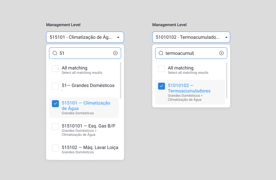
During my collaboration with other product designers on the product and services modules, I noticed diverse naming conventions for product categories across departments. Some used full category IDs, while others referenced level names, impacting the design of the global category selector dropdown.
To ensure inclusivity, we carefully crafted the global category selector component to accommodate these variations and display each category’s path, ensuring familiarity and ease of use for all workers.

Establishing item connections on Product Ranges
Simultaneously, I began working on the Product Range module, collaborating closely with its Product Owner and stakeholders. The tool’s foundations relied on data from multiple departments, requiring thorough workflows to ensure no details were overlooked.
This module faced multiple challenges. Firstly, the underlying logic of the legacy version was being questioned, potentially rendering certain methods and rules obsolete. Secondly, a new set of internal structures needed to be incorporated, requiring the module to adapt accordingly. Lastly, the management of these ranges varied depending on the role of the worker involved.
Contract ranges as a test-drive
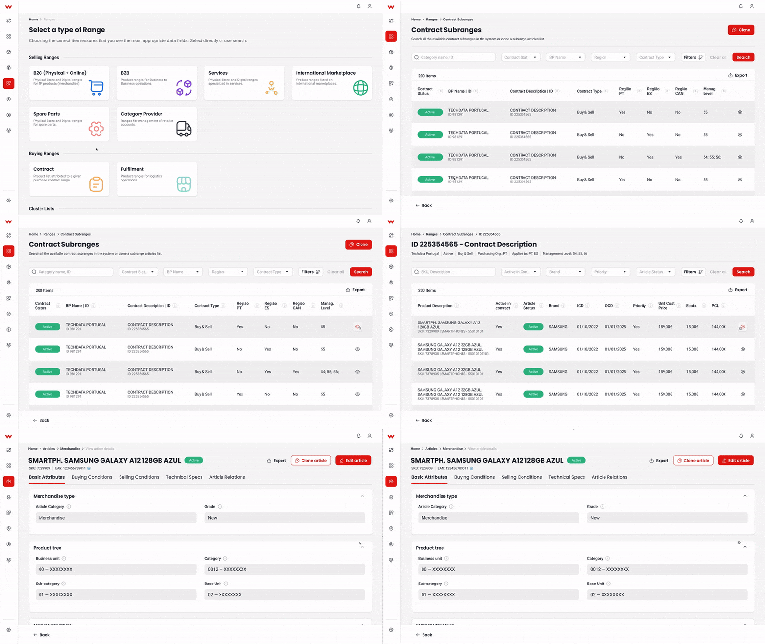
As additional details on various range types emerged, I focused on Contract Ranges, a simpler type linking products to specific company contracts. This served as a foundation for exploring visualization flows for these entities and their products. The aim was to establish standard patterns, language, and interactions for future range types.
After thorough interface and workflow discussions, I arrived at a visual solution effectively displaying diverse entities and details, enhancing exploration within them. This interface, displaying tables, filters, interaction buttons, and customized features, laid the groundwork for subsequent modules, providing crucial functionalities such as file exporting/importing.
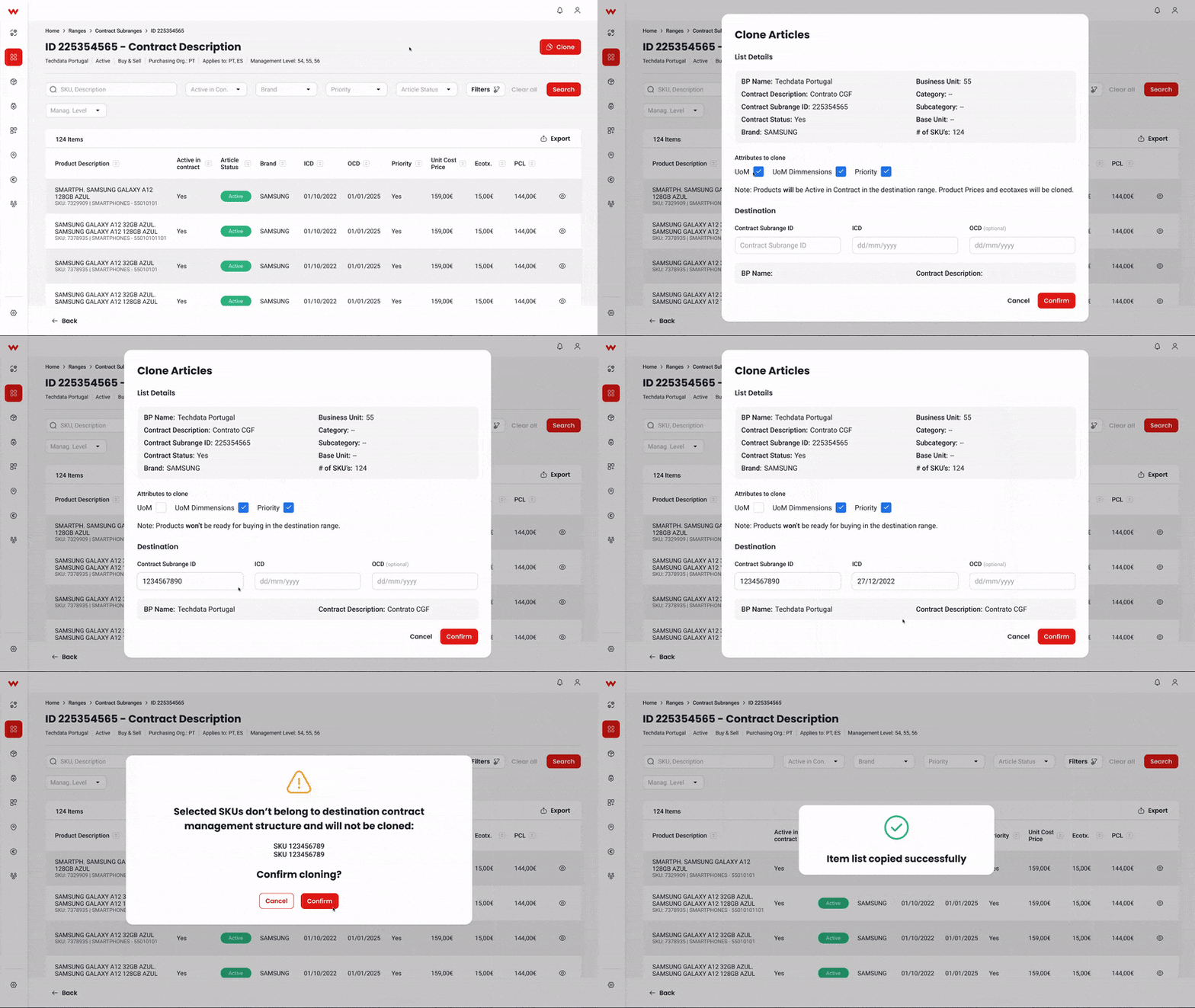
Additionally, in the contracts sub-range, we devised a ‘Clone Tool’ to consolidate products for specific contracts. Although it wasn’t promptly implemented, the exploration of this tool proved invaluable, guiding the development of other tools within the product ranges module and even inspiring other modules.
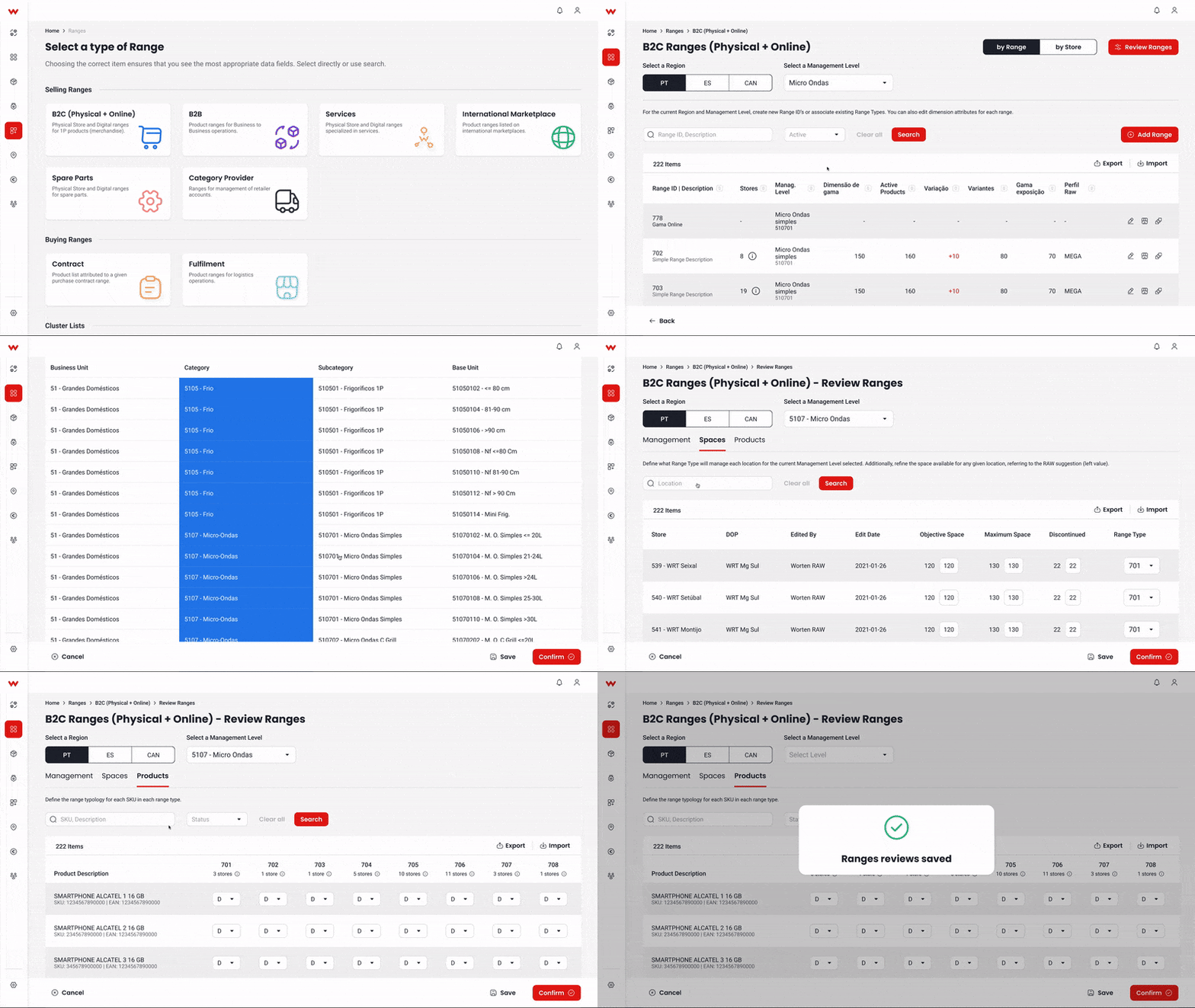
Merging workflows in B2C Ranges
Leveraging findings from contract sub-range research, we developed B2C ranges to address complex item management needs. Collaborating closely with product owners and department heads, we ensured alignment with diverse user perspectives. An user workflow was devised, granting users flexible access to product ranges for efficient data analysis.
Close collaboration with business, location, and stock managers ensured the tool met diverse user needs. Guided by each department’s B2C range approach, efforts focused on standardizing the tool for all use cases.
The tool facilitated manual management through a three-step process. Users defined interactions between product ranges and categories, aided by a user-friendly table interface. Connections between product ranges and physical locations were established, allowing adjustments to placement and stock allocation.
Distribution formats specified product availability across locations, adjusted annually based on sales metrics. The interface also streamlined range management, with automation via category and contract details.
Navigating biases from legacy software
In the product ranges module, feedback from experienced users heavily relied on their knowledge of legacy software, which complicated streamlining workflows. Actions perceived as intuitive by long-term users proved confusing for newcomers.
Balancing simplicity without alienating senior users, we ensured workflows were clear, intuitive, and flexible, empathizing with users of varying experience levels. This highlights the challenge of transitioning from legacy systems while accommodating diverse user experiences, emphasizing empathetic design and iterative refinement.
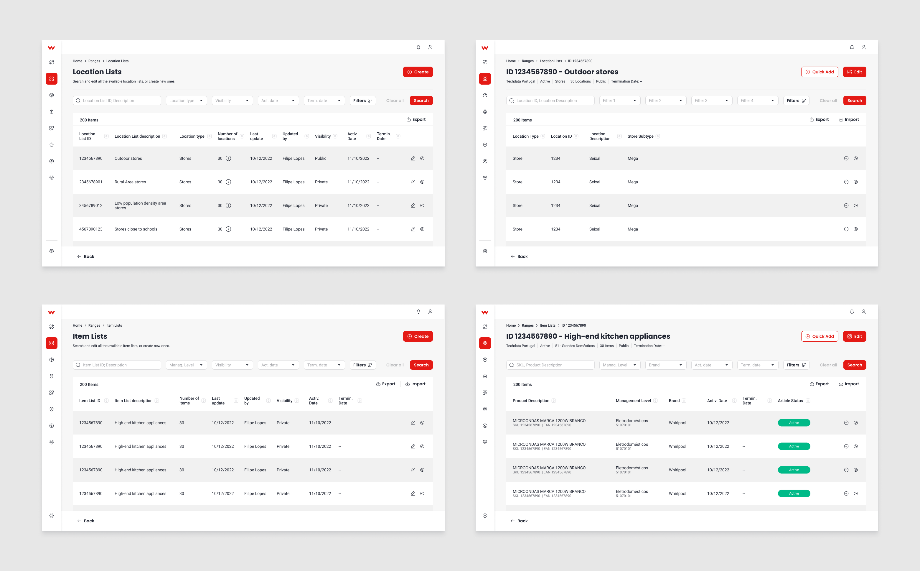
Introducing flexible lists
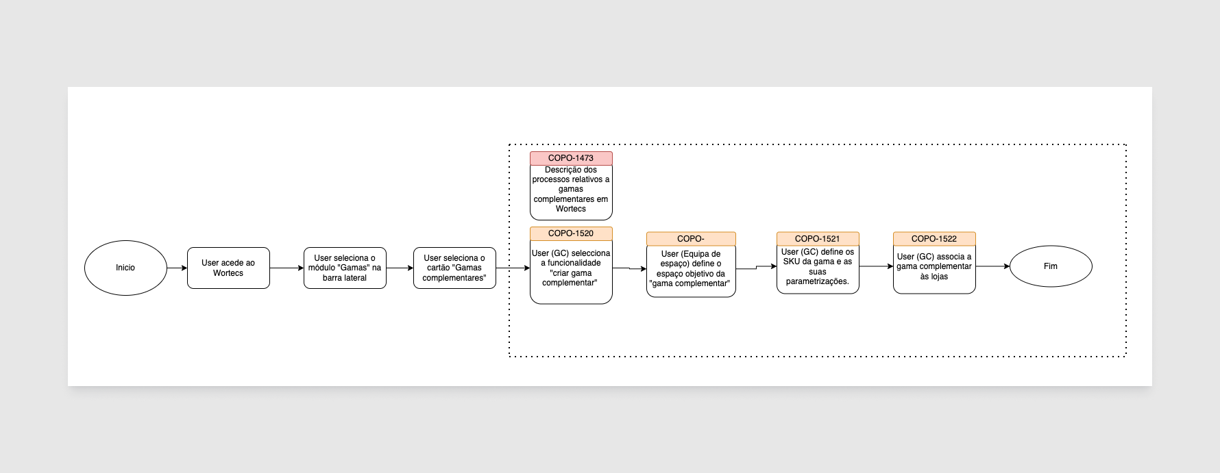
In this module, we aimed to maintain core company structures while embracing digital changes. Adapting to evolving technology, we explored flexible product interactions. Core structures were redefined as item and location lists, enhancing agility in data aggregation and analysis.
These flexible ranges complemented traditional structures, facilitating efficient management across diverse contexts like marketplaces and B2B scenarios. Location lists also streamlined physical and digital store aggregation, meeting diverse business needs effectively.
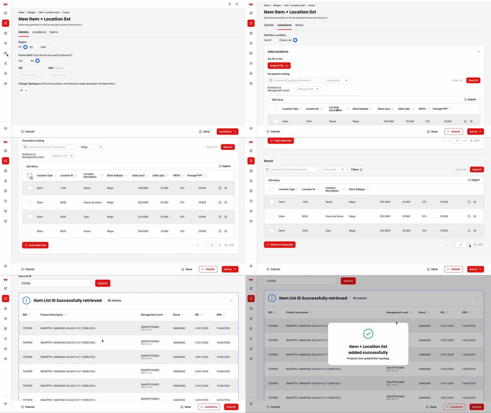
As we detailed interactions, my focus turned to designing interfaces and workflows for managing these entities. List creation simplified the process, enabling users to input details, explore items, and populate lists via file imports or manual selection. Accessible system-wide, these lists facilitated quick adjustments and usage for analysis or logistics setup.
Bringing it all together
These technologies received positive feedback, simplifying future tasks and inspiring confidence in adopting similar concepts for other product ranges. We developed additional suggested product ranges tailored to newer business models like international marketplaces and dedicated services, using the logic of product and location lists, or what we termed cluster lists, considering each entity’s unique nature.
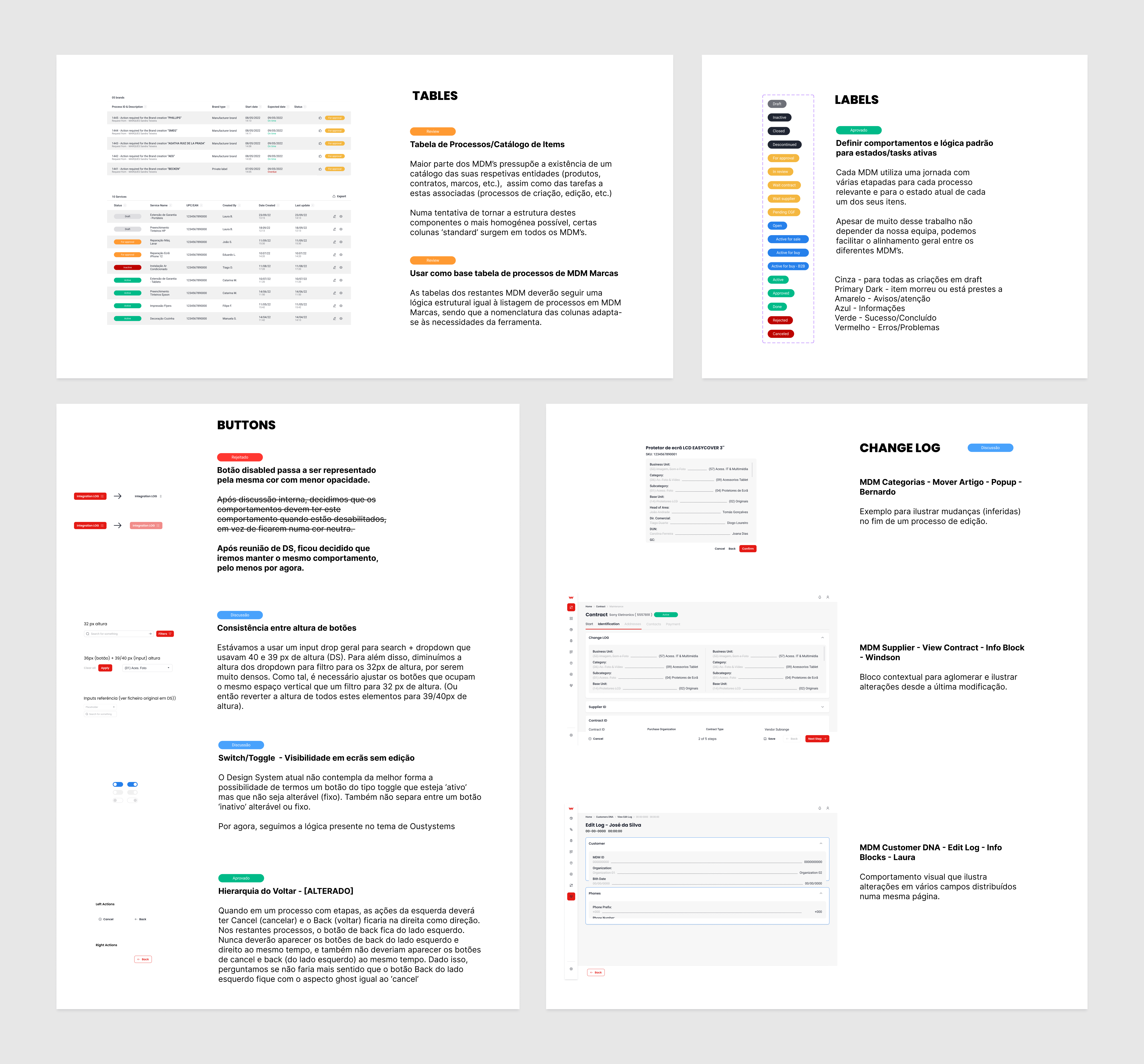
During the module’s development phase, I oversaw and supported all designers on the Wortecs project. Ensuring consistency across modules was vital, focusing on documentation for language, logic, and design system unification. This enhanced team familiarity with patterns and workflows, facilitating the implementation of user stories and sharpening focus on usability and tool strategy.
Resisting the excel temptation
During design, user feedback highlighted the need for an Excel-like system in Wortecs workflows. Initially, attempts to replicate Excel’s functions proved impractical. Instead, we focused on integrating Excel through file imports/exports, while addressing its limitations in management tasks.

QoL improvements on Business Partner
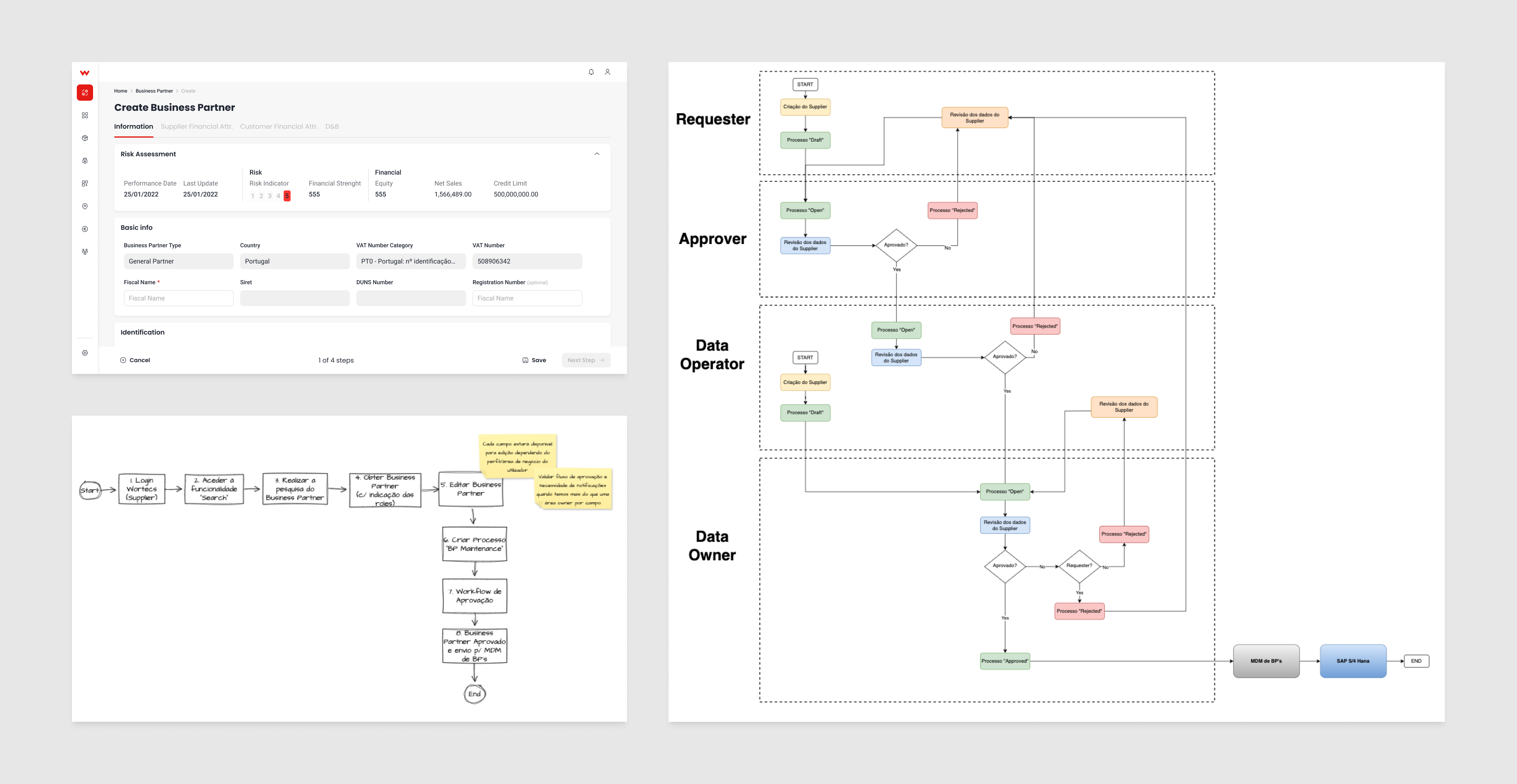
Due to management priorities, the Business Partner module became pivotal, and I assumed control as development began. Despite predefined logic and interfaces, the module underwent frequent updates, necessitating regular revisions. It mainly handled supplier and contract creation and management, presenting challenges in handling complex legal and administrative information.
Reducing redundancy
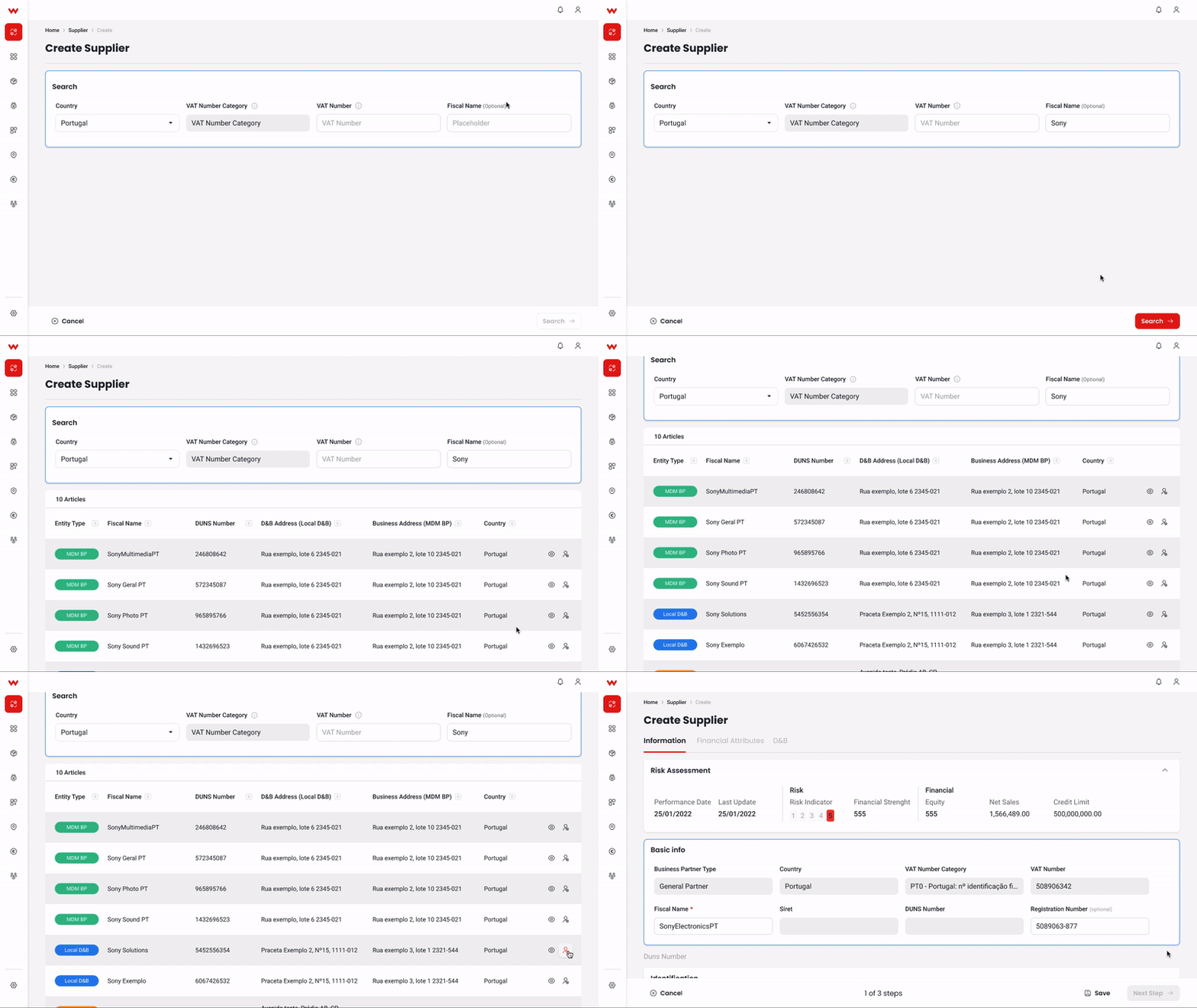
Managing the business partner module uncovered complexities from diverse user roles accessing and performing actions. Efforts focused on aggregating role-specific information and streamlining actions. Solutions like refining the search function during creation to avoid duplications aimed to simplify processes.
Quick wins on user experience
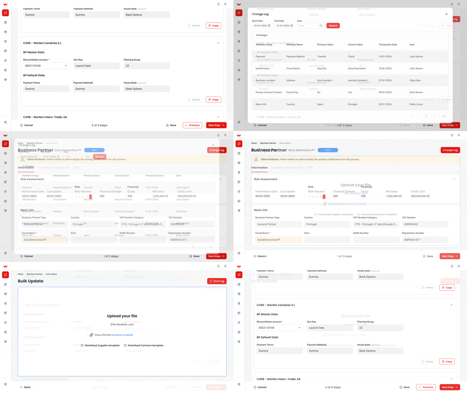
Beyond process optimization, efforts turned to enhancing user experience by displaying edited elements, allowing bulk updates, enabling copying information blocks, among others. These enhancements aimed to boost workflow efficiency within resource constraints, requiring swift iterations to implement new requests or optimize existing ones.
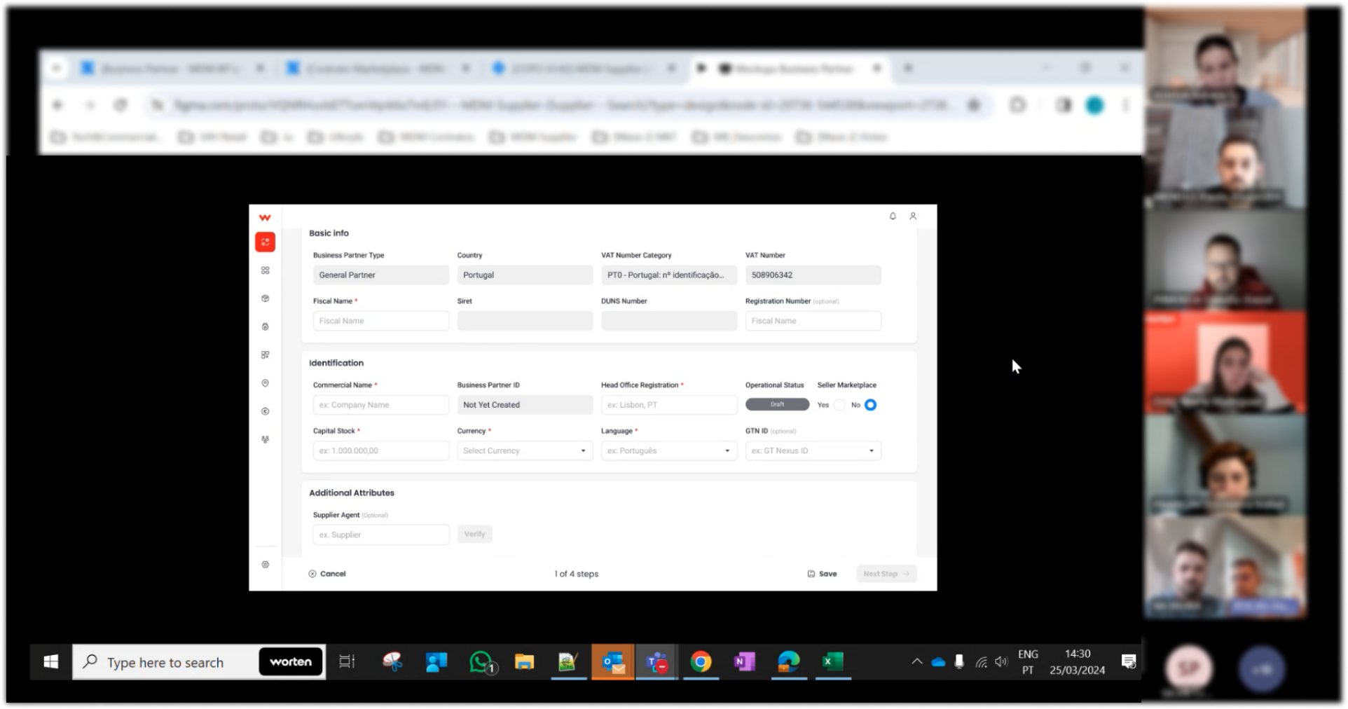
User feedback at this stage enabled precise iterations, uncovering previously unnoticed issues and validating intricate workflows. This highlights the value of user research in refining design processes and ensuring positive reception of complex workflows by end-users.
Overall, my involvement in the business partner module showcased the challenges and rewards of enterprise product development, underscoring the importance of collaboration, user feedback, and iterative refinement in delivering effective solutions that meet evolving business requirements.
Reflect
Odyssey's lessons
Letting the product mature
As the product matured, user feedback became essential for testing and adaptation. Transitioning enterprise products gradually involves integrating user exploration and feedback to ensure usability, flexibility, and consistency. Despite thorough research during design, new exceptions arose, emphasizing the project’s complexity. Continuous user involvement ensured alignment with business needs and usability objectives.
Managing data-heavy tools can lead to complex scenarios, requiring vigilance to maintain project focus during unforeseen challenges. Despite diligent planning, unexpected factors often transform once-efficient workflows into laborious tasks, requiring substantial revisions. This underscores the importance of designing flexible structures, capable of accommodating changes without jeopardizing project integrity.
My learnings
Initial user feedback across departments and roles was overwhelmingly positive, with users praising the software’s ability to streamline mundane tasks and enhance efficiency through specific tools. The integration of various business aspects within a unified platform fostered curiosity and autonomy, promoting department cooperation and reducing barriers. Additionally, users expressed enthusiasm for the product’s lighter, friendlier interface, highlighting the impact of UI/UX on user satisfaction.
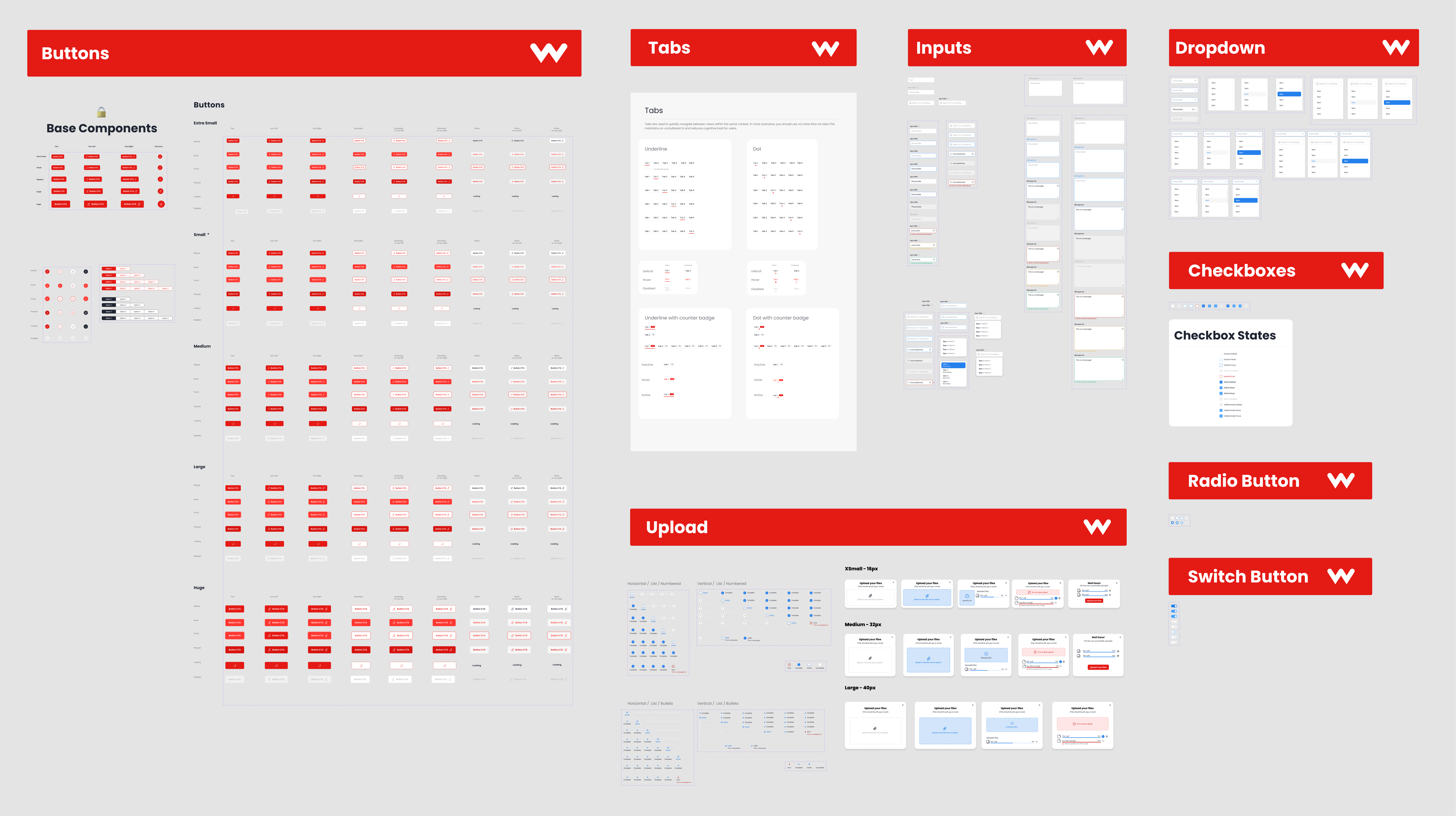
The project stressed the importance of a robust design system in maintaining consistency and efficiency across products. Despite initial shortcomings, the design system sped up design processes and justified the investment in its development. The project’s complexity provided an opportunity to refine the design system further, laying the groundwork for future enhancements.
Throughout the project, the design team’s contributions were instrumental, driving creative solutions and prompting reevaluation of established company practices. The freedom to question existing processes led to innovative approaches to information display and interaction, reshaping company concepts and refining workflows.
This journey provided invaluable insights into usability, business management, and problem-solving strategies. The collaborative effort of the design team, coupled with user-centric design practices, propelled the project forward, resulting in a successful enterprise product that met both business needs and user expectations.
